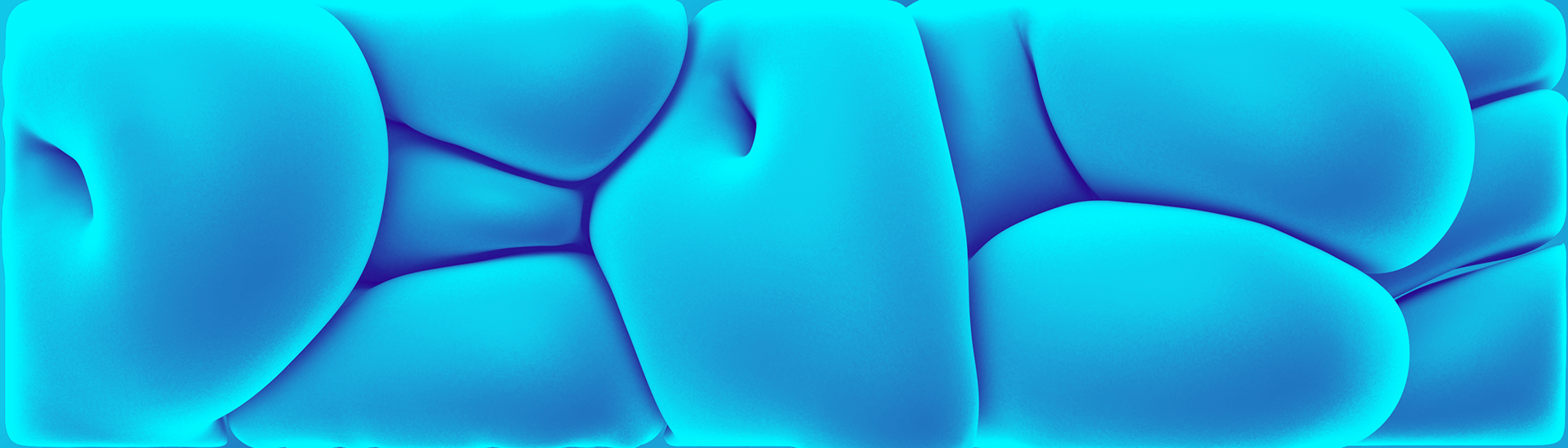
Bloated Type is a visual exploration around volume, constraint, and typographic tension.
Starting from a simple word, I experimented with inflation and spatial limits to let each letter find its own form. The result is a set of unique, soft geometries shaped as much by pressure as by composition.
This study started as a hands-on experiment with typography in Cinema 4D.
Using an inflation setup, each letter is treated as a malleable object rather than a fixed shape. A rigid box acts as a constraint, forcing the type to negotiate space, collide, compress, and adapt.
Instead of controlling the final form, I focused on creating the conditions and observing how the system resolved itself.
The word bloated is intentional.
The letters feel inflated, almost uncomfortable, occupying more space than they should. This excess creates tension, but also balance. Every character presses against the others until a temporary equilibrium appears.
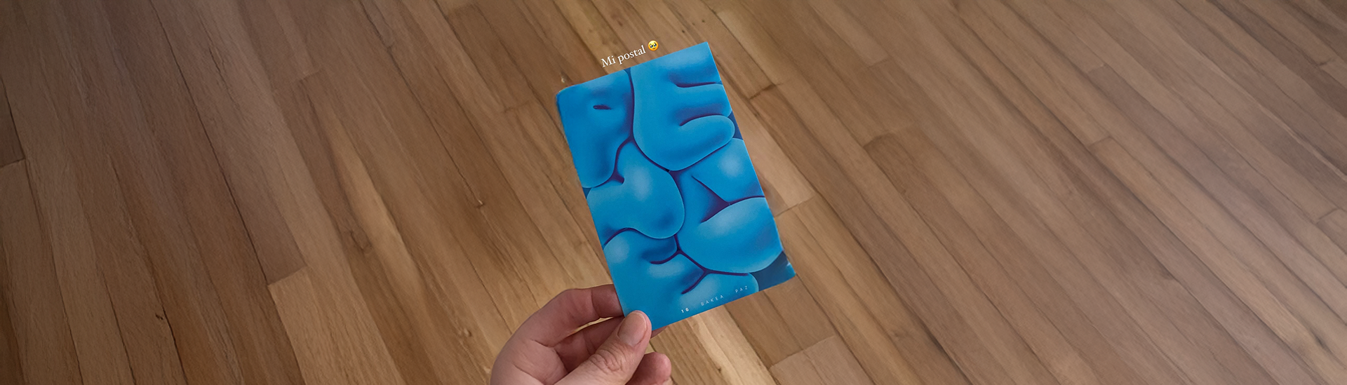
This visual study later became the foundation for a short animation created for OFFF Festival’s 25th Open Call.
The animated piece was selected and screened during the festival, extending the exploration from static form into rhythm, weight, and timing.
Projects like this sit outside client work. They exist to test ideas, sharpen intuition, and stay curious.
Bloated Type is less about typography as communication and more about typography as matter.